Presenting Market Research Data
- Once market research data has been gathered it need to be converted into a form which is easy to understand and capable of being used to support business decision-making
- Common methods of presenting data include tally charts, bar charts, pie graphs and scatter graphs
Tally charts
- A table or tally chart, is a simple method used to record data in its original form
- It is particularly useful for recording frequency of an event as it is happening
- E.g. It may be used to record the number of customers entering a retail store
- Each time a particular event happens, a small vertical line is drawn
- Groups of five occurrences are recorded with a diagonal line through four vertical lines
- These groups of five can be easily totalled to identify frequency
- It is particularly useful for recording frequency of an event as it is happening
- In many cases, tally chart data is converted into a chart or graph to make it more visually appealing
Worked example
Susie asks her friends to select their favourite type of pet
| Dog | Cat | Dog | Dog | Dog |
| Rabbit | Dog | Rabbit | Cat | Cat |
| Cat | Dog | Dog | Rabbit | Dog |
| Cat | Cat | Dog | Dog | Dog |
Represent the data in a frequency table. You can use a tally chart to help
Step 1: Draw a table with a tally and frequency column with types of pet as row headers
| Type of Pet | Tally | Frequency |
|
|
||
|
|
||
|
|
|
Step 2: Tally the data
| Type of Pet | Tally | Frequency |
|
|
||
|
|
||
|
|
|
Step 3: Total the tally data and add to the frequency column
| Type of Pet | Tally | Frequency |
|
|
11 |
|
|
|
6 |
|
|
|
|
3 |
Graphs and charts
- Information presented in graphs and charts is often easy to understand because it is presented visually
- The type of data that has been collected and what it is to be used for will affect the form of presentation which will be used
- Quantitative data tends to be relatively easy to present in a chart or graph
- Qualitative data may be better presented in a report
Types of Graphs and Charts
Name |
Explanation |
Example |
|
Bar chart |
|
|
|
Pie chart |
|
|
|
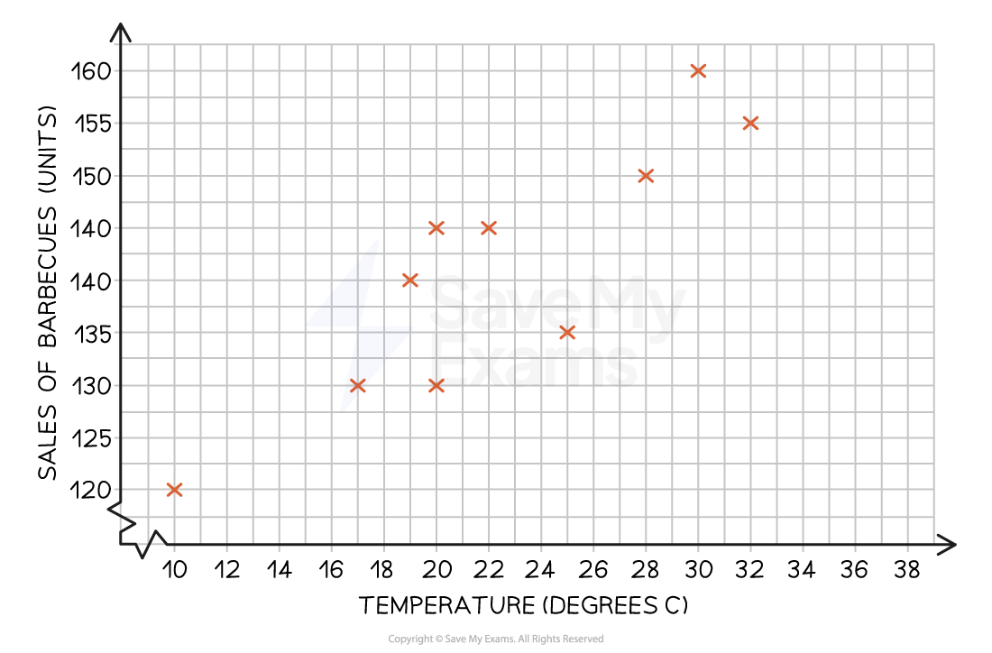
Scatter graph |
|
|