Energy Security (AQA A Level Geography)

Topic Questions

1
Sme Calculator
6 marks
Figures 12a and 12b are maps showing GNI per capita and Energy consumption per capita.


Figure 12a

fig-12a-paper2-specimen-aqa-alevel-geography

Figure 12b

fig-12b-paper2-specimen-aqa-alevel-geography

Using Figure 12a and Figure 12b, analyse the relationship between GNI per capita and Energy consumption per capita.

[6]

Did this page help you?

2
Sme Calculator
9 marks

Figure 13 shows trends in nuclear power and hydroelectricity consumption from 1987-2012.


Figure 13

fig-13-paper2-specimen-aqa-alevel-geography

With reference to Figure 13 and your own knowledge, assess the success of strategies to increase energy supply through developing nuclear power and renewable energy.

[9]

Did this page help you?

3
Sme Calculator
4 marks
Outline a strategy used to manage energy consumption.


[4]

Did this page help you?

4
Sme Calculator
6 marks

Figure 9a shows the location and amount of economically viable oil reserves at different oil prices in 2016.

Figure 9b shows the average oil price between January 2004 and January 2020.

Figure 9a

The location and amount of economically viable oil reserves at different oil prices in 2016

fig-9a-inserts-paper2-nov2021-aqa-alevel-geography
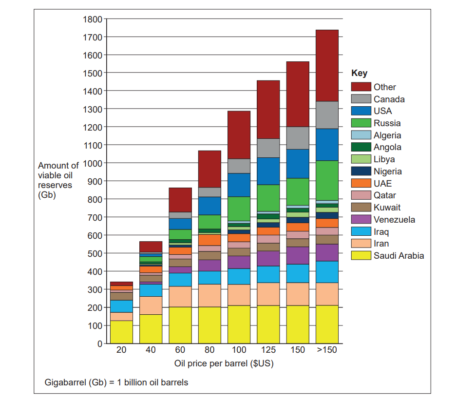
Note: Viable oil reserves are those that can be profitably extracted.

Figure 9b

inflation-adjusted-oil-price-graph

Inflation adjusted oil price graph - average oil price between January 2004 and January 2020

Analyse the data shown in Figure 9a and Figure 9b.

[6]

Did this page help you?

5
Sme Calculator
9 marks

Figure 10a shows information produced by the Canadian government about greenhouse gas emissions and tar sand developments producing oil in Canada.

Figure 10b shows a tar sand oil production area in Alberta, Canada.

Figure 10a

infographic-turning-tide-on-emissions-horizontal-2048x1004

Information produced by the Canadian government about greenhouse gas emissions and tar sand developments producing oil in Canada

Figure 10b

fig-10-inserts-paper2-nov2021-aqa-alevel-geography

Using Figure 10a, Figure 10b and your own knowledge, to what extent do you agree that the environmental impacts of the development of a major energy source such as this are always negative?
[9]

Did this page help you?

6
Sme Calculator
1 mark
Which of the following has the correct examples of primary and secondary sources of energy in the correct columns?

[1]
  Primary energy Secondary energy
A A water wheel powered by a 
river used to drive machinery in
a factory.
Releasing radiation from uranium to convert water to
steam for electricity powering a town.
B Burning coal and wood in a
multi-fuel stove for heat in the
home.
Gas transfer by pipeline to power a gas cooker in the
home.
C Production of petrol from crude
oil to drive cars.
Conversion of biogas from organic decomposition of
animal waste.
D Electricity generated from an
HEP scheme used to power a
field centre.
Geothermal power heating ground water supplies directly
into the home.

Did this page help you?

7
Sme Calculator
6 marks

Figure 9a shows the world’s top ten coal producing countries in 2015. 

Figure 9b shows coal consumption in the top ten coal consuming countries and the rest of the world in 2015.

Figure 9c shows a Spearman’s rank calculation used to study whether there is a relationship between production and consumption of coal in the countries shown in Figure 9a.

Figure 9a

The world’s top ten coal producing countries in 2015

fig-9a-inserts-paper2-june2019-aqa-alevel-geography

Figure 9b

Coal consumption in the top ten coal consuming countries and the

rest of the world in 2015

fig-9b-inserts-paper2-june2019-aqa-alevel-geography

Figure 9c

The null hypothesis is: ‘There is no relationship between
production of coal and consumption of coal.’

Rs Value 0.806

Critical Value at 0.05 significance level

(n = 10)

0.648

Analyse the data shown in Figures 9a, 9b and 9c.

[6]

Did this page help you?

8
Sme Calculator
9 marks

Figure 10a shows the renewable and nuclear energy mix of selected European countries in 2012.

Figure 10b is a relief map of Europe.

Figure 10c shows average annual precipitation.

Figure 10a

The renewable and nuclear energy mix of selected European countries in 2012

fig-10a-inserts-paper2-june2019-aqa-alevel-geography

Figure 10b

A relief map of Europe

fig-10b-inserts-paper2-june2019-aqa-alevel-geography

Figure 10c

Average annual precipitation

fig-10c-inserts-paper2-june2019-aqa-alevel-geography

Using Figures 10a, 10b, 10c and your own knowledge, assess the relationship between energy supply and physical geography.
[9]

Did this page help you?

9
Sme Calculator
1 mark
Which of the following is a correct list of gases that are major contributors to the enhanced greenhouse effect?


[1]

  • Methane, helium, oxygen

  • Methane, hydrogen, hydrofluorocarbons

  • Methane, hydrofluorocarbons, carbon dioxide

  • Methane, carbon dioxide, hydrogen

Did this page help you?

10
Sme Calculator
9 marks

Figure 10a shows a hydro-electric scheme in Scandale Beck, an upland river in the Lake District.

Figure 10b shows electricity generation for the scheme in selected months between 2015 and 2017.

Figure 10a

fig-10a-paper2-june2018-aqa-alevel-geography

Figure 10b

Month Potential output (MWh) Actual output (MWh)
November 2015 653.04 646.00
April 2016 653.04 217.00
August 2016 674.81 276.00
November 2016 653.04 268.00
January 2017 674.81 181.00

MWh = Megawatt-hours, a measure of electricity generation

Using Figure 10a, Figure 10b and your own knowledge, assess the extent to which renewable energy can be used to achieve energy security.
[9]

Did this page help you?