How far do you agree with this statement?
[20]
Did this page help you?
[20]
Did this page help you?
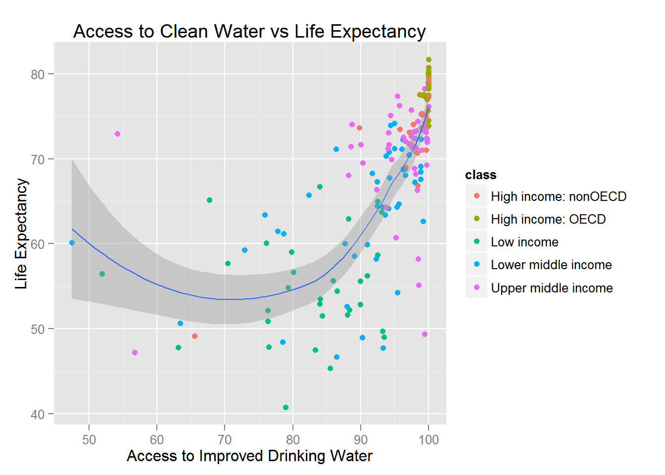
Figure 8 shows the relationship between access to improved drinking water and life expectancy for selected countries by income group.
Figure 8

The figure portrays the correlation between life expectancy and access to clean water. From the figure above, it is obvious to note the importance clean water has on people around the globe. Countries in which all their citizens have access to clean water have the highest life expectancy. Source: Isma Shahid 2015
[9]
Did this page help you?
Outline the relationship between the physical environment and health in a local area you have studied.
[4]
Did this page help you?
Figure 7a shows deaths attributed to air pollution by country income groups in 2016.
Figure 7b shows the global distribution of the concentration of PM2.5 atmospheric pollution in 2016.
Figure 7a
deaths attributed to air pollution by country income groups in 2016

Note: PM2.5 refers to fine particles with diameters less than 2.5 micrometers.
Figure 7b
the global distribution of the concentration of PM2.5 atmospheric pollution in 2016

Note: The WHO Guideline for healthy air is less than 10 PM2.5
[6]
Did this page help you?
‘Non-communicable diseases are harder to manage than biologically transmitted diseases.’
With reference to one or more places you have studied, assess the extent to which you agree with this statement.
[20]
Did this page help you?
Figure 7a shows the global pattern of obesity in 2014.
Figure 7b shows the highest ranked countries with diabetes in 1980 and 2014.
Figure 7c shows a Spearman’s rank calculation used to study whether there is a relationship between prevalence of obesity and diabetes in the countries shown for 2014.
Figure 7a
The global pattern of obesity in 2014

Figure 7b
Highest ranked countries with diabetes, 1980 and 2014

Figure 7c
The null hypothesis is: ‘There is no relationship between obesity and diabetes in the selected countries.’
| Rs Value | 0.598 |
|
Critical Value at 0.05 significance level (n = 14) |
0.538 |
[6]
Did this page help you?
Figure 8 is a newspaper article from The Guardian which discusses food security issues in Ghana.
Figure 8

[9]
Did this page help you?