1 6 marks
Figure 10 shows the changing population structure of Iran.
Figure 10
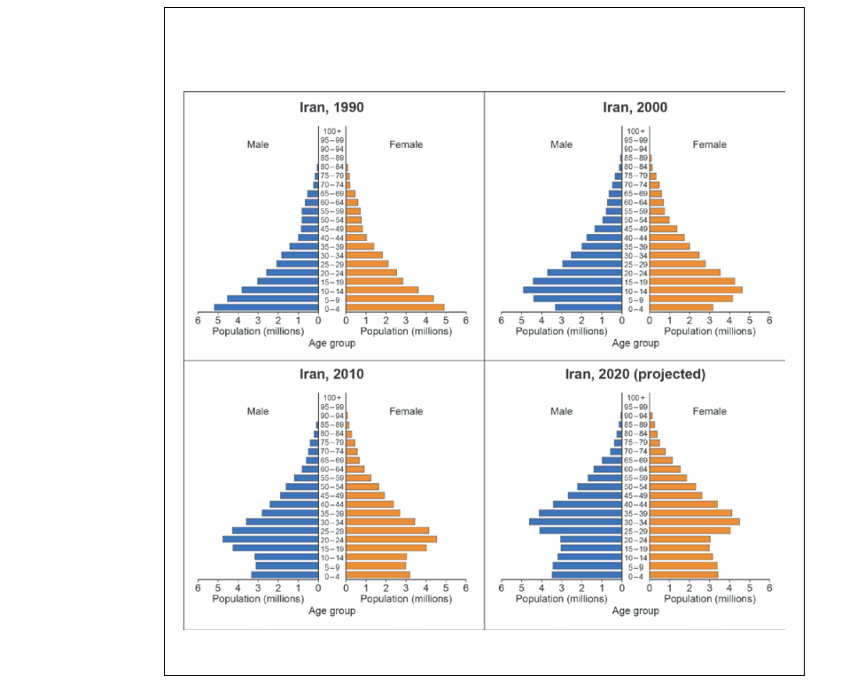
Analyse the trends illustrated by the population pyramids for Iran shown in Figure 10.
[6]
Did this page help you?
Figure 10 shows the changing population structure of Iran.
Figure 10
Analyse the trends illustrated by the population pyramids for Iran shown in Figure 10.
[6]
Did this page help you?
Figure 11 is a map showing countries of origin of asylum seekers in the European Union in 2014.
Figure 11

Assess the factors that might account for the spatial variation shown in Figure 11.
[9]
Did this page help you?
Figures 7a and 7b show population pyramids for Cuba in 1980 and 2010.
Figure 7c shows key vital rates for Cuba for selected years.
Figure 7a – population pyramid for Cuba in 1980
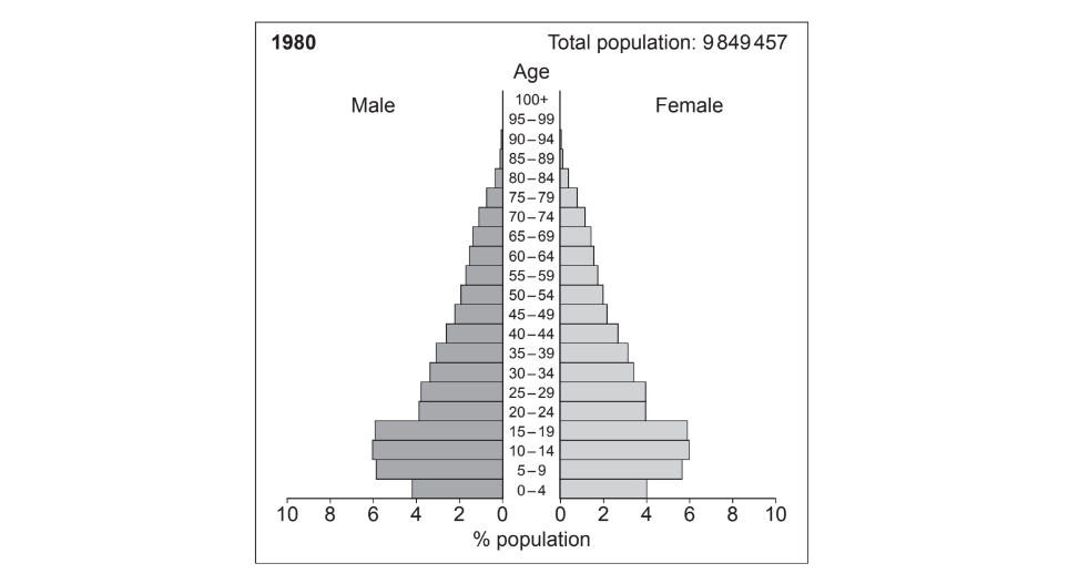
Figure 7b – population pyramid for Cuba in 2010
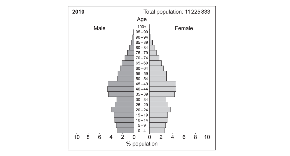
Figure 7c – key vital rates for Cuba for selected years
| 1960 | 1980 | 2000 | 2018 | |
| Birth rate (per 1000) | 32.0 | 16.3 | 13.1 | 10.2 |
| Death rate (per 1000) | 8.8 | 5.9 | 7.2 | 9.0 |
| Life expectancy (years) | 63.8 | 73.8 | 76.7 | 78.7 |
| Natural increase (%) | 0.23 | 0.10 | 0.06 | 0.01 |
[6]
Did this page help you?
[9]
Did this page help you?
Figure 8a shows the number of refugees received by selected European countries from 1 January to 30 June 2015.
Figure 8b shows the rise of anti-immigration parties in selected European countries between 2013 and 2018.
Figure 8c shows placards used at a ‘Refugees welcome here’ march in London held in 2016.
Figure 8a
the number of refugees received by selected European countries from 1 January to 30 June 2015

Figure 8b
the rise of anti-immigration parties in selected European countries between 2013 and 2018
 Figure 8c
placards used at a ‘Refugees welcome here’ march in London held in 2016

Did this page help you?
In Germany in 2015, fighting broke out in a tented camp for asylum seekers. The fighting occurred between groups of Pakistanis and Albanians. It took police several hours to quell the violence.
Cornwall is very reliant on EU migrant labourers to work on a temporary basis in agriculture, for example, picking daffodils. These EU migrants boost the local economy by spending in local shops.
In Poland, since 2011, many economic migrants of child-bearing age have returned from western Europe and there has been a rise in fertility rates to 1.3.
In Myanmar, Rohingya Muslims are living in refugee camps on the border of Bangladesh. Conditions in the camps are terrible with people suffering from malnutrition and ill health.
Did this page help you?
Death rates rise due to a larger proportion of elderly people. Healthcare and technological advancements mean life expectancy rises. Birth rates fall due to improved education.
Death rates fall due to improved sanitation and greater agricultural productivity. Infant mortality increases due to periods of famine and this causes a corresponding rise in birth rates.
Life expectancy continues to rise due to better sanitation and healthcare causing a continued fall in death rates. Infant mortality falls due to improved diets, causing a corresponding fall in birth rates.
Death rates are fairly stationary due to good levels of healthcare. Life expectancy continues to rise due to improved diets. Birth rates fall due to high levels of female education.
Did this page help you?
Figure 8a shows the population structure for Thailand in 1980, 2010 and 2030 (projected).
Figure 8b shows data about Thailand’s economy and population between 1980 and 2015.
Figure 8a

Figure 8b
| 1980 | 2000 | 2010 | 2015 | |
| Fertility rate (births per woman) | 3.4 | 1.7 | 1.5 | 1.5 |
| Life expectancy (years) | 64.4 | 70.6 | 73.9 | 75.1 |
| GDP growth rate (%)* | 5.2 | 4.5 | 7.5 | 2.9 |
| Adult literacy (%) | 88.0 | 92.6 | 96.4 | 94.0 |
|
* GDP (Gross Domestic Product) growth rate – a measure of how fast the economy is growing. |
||||
[9]
Did this page help you?
Did this page help you?
the prevalence of disease and poor health within a specific area or population
the number of deaths per 1000 people per year
the biological age of someone’s body regardless of their chronological age
a medical condition that is non-infectious and non-transmissible in young people
Did this page help you?
Figure 7a, shows the predicted effects of a 3° C increase in temperatures on crop yields by 2050.
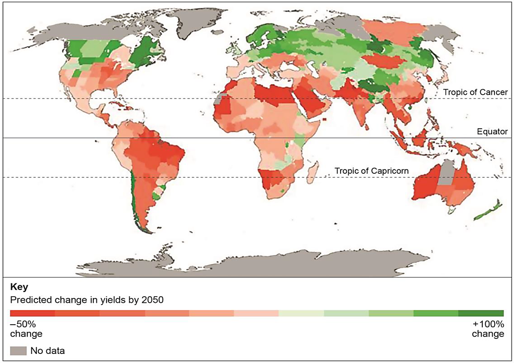
Figure 7b, shows the percentage of the population by country who were undernourished in 2013.

Did this page help you?
To what extent do you agree with this statement?
[20]
Did this page help you?