Selecting & Interpreting Data Representations (Edexcel GCSE Statistics)
Revision Note

Author
RogerExpertise
Maths
Selecting Data Representations
What should be considered when choosing a data representation?
Representing data in tables, graphs, charts, diagrams, etc. can make it easier to understand the data and spot patterns in it
Such representations of data may be referred to as visualisations (i.e., ways of 'seeing' or visualising the data)
Statistical software and spreadsheets can create these sorts of representations from data entered into them
When choosing a representation, a number of factors should be considered:
The target audience
For an audience not especially familiar with statistics, a simple visualisation would be more appropriate
e.g. bar chart, pictogram or pie chart
Whereas for an audience of experienced statisticians, a more technical visualisation could be used
e.g. box plot, cumulative frequency diagram or histogram
The nature of the data
Some representations are or are not appropriate for certain types of data
e.g. bar charts are good for discrete data but should not be used for continuous data
Scatter diagrams are appropriate for bivariate data
Histograms are appropriate for grouped data
The particular strengths (and weaknesses) of different representations
Different representations can highlight or obscure different features in the data
e.g. bar charts and line graphs make patterns in the data clear and data values can often be read off the scale
Tables contain exact values but do not clearly show patterns or trends in the data
Pie charts show proportions clearly but do not show exact data values
On the exam you may be asked to:
Choose a representation that should be used for a set of data and justify your choice
Comment on or criticise a representation that has been used
Compare data sets that have been presented in different formats
and comment on the strengths and weaknesses of each format for the data shown
Exam Tip
If asked to choose a data representation for a data set
be sure to justify your decision based on the nature of the data, the intended audience, and the strengths and weaknesses of your chosen representation
Worked Example
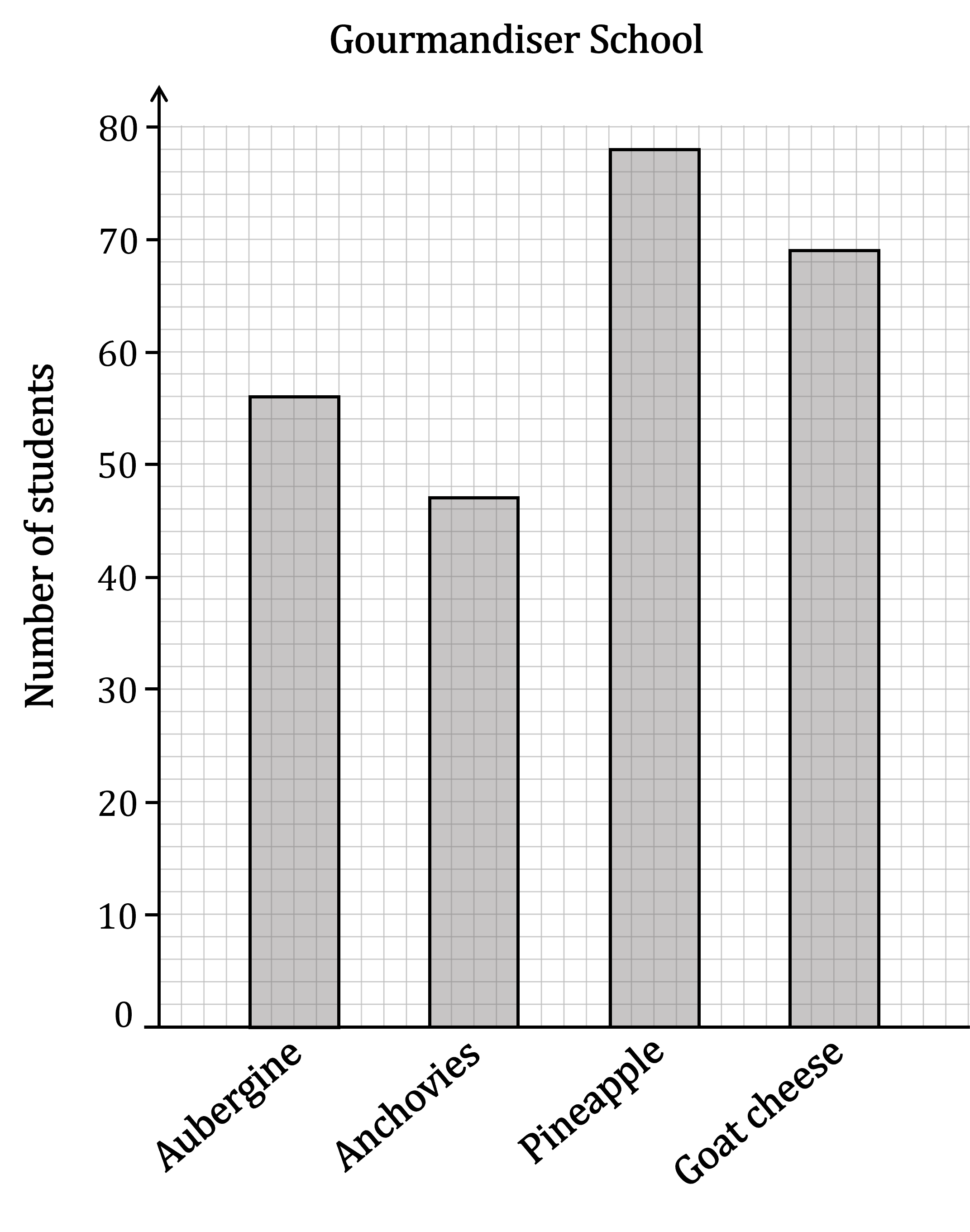
The diagrams show information about the preferred pizza toppings of students at two schools, the Pescador Academy and the Gourmandiser School.
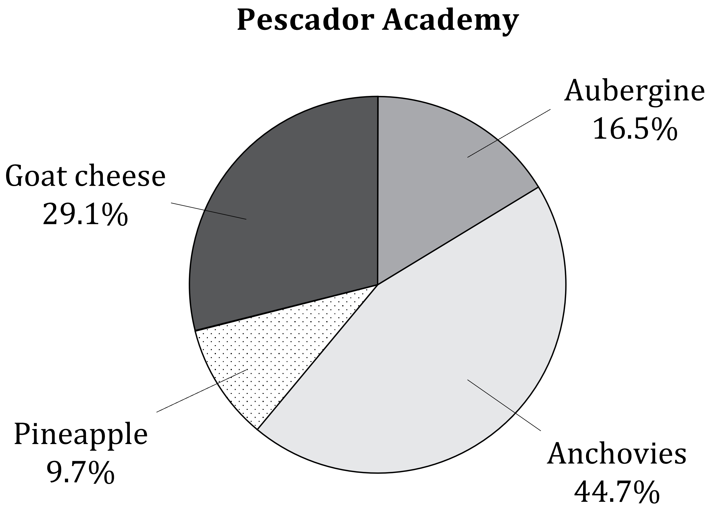
Mary is interested in the proportions of students at each school who prefer the different toppings.
(a) State with a reason which of the two data representations will make it easier for Mary to find the information she wants.
The pie chart will be easier for Mary to use, because the proportions (in percentage form) are indicated directly on the diagram.
(b) Determine which school has the higher proportion of students who prefer goat cheese. Show workings to support your answer.
29.1% of the students at the Pescador Academy prefer goat cheese
We need to calculate the percentage for the Gourmandiser School
From the bar chart, 69 students prefer goat cheese
And there is a total of 56+47+78+69 students in total
![]()
The proportion of students who prefer goat cheese at the Pescador Academy (29.1%) is higher than the proportion at the Gourmandiser School (27.6%).
Titus and Irma are also examining the two diagrams.
Titus says that it is obvious that there are more students at the Pescador Academy who prefer anchovies than there are at the Gourmandiser School.
Irma says there is no way to tell from the diagrams which school has a greater number of students who prefer anchovies.
(c) Explain with a reason which student is correct.
Nearly half the students at the Pescador Academy prefer anchovies, while at the Gourmandiser School it is the least popular choice
However we don't know from the pie chart how many students are at the Pescador Academy
If the Pescador Academy is a small school, then 44.7% of its students may actually be less than the 47 students who prefer anchovies at the Gourmandiser School
So Irma is correct
Irma is correct. The pie chart doesn't tell us how many students in total are at the Pescador Academy, so there is no way to know exactly how many students there prefer anchovies.
Misrepresentations in Statistical Diagrams
What sort of misrepresentations can appear in statistical diagrams?
If a data representation gives a misleading or incorrect impression about the data, this is known as a misrepresentation
Sometimes this may be the result of a mistake
But sometimes it may be done intentionally in order to be misleading
If scales in diagrams do not go up in equal steps, or if parts of them are missed out
this will distort the sizes and shapes of things plotted against them
If scales in diagrams do not start at zero
this can give a misleading sense of the true size of bars, etc., plotted against them
Note that scales don't have to start at zero
But not starting at zero can change the impression given about the data
If axes on a graph are not labelled
then there is no way to know for sure what the data represents
If a graph or chart doesn't have a key
then it may be impossible to interpret what it is meant to show
If a diagram uses bright colours
it can make some parts of a diagram stand out more than others
If lines on a graph are drawn too thick
it can make it difficult to read the graph precisely
If frequency densities for histograms are calculated incorrectly, or if the class widths are plotted incorrectly on the horizontal axis
the bars on the histogram will not represent the data accurately
What are possible problems with 3D representations?
3D representations can look nice and be quite 'eye-catching'
but they can also distort the data or be misleading
For example, in a 3D pie chart
the angles of the different sections are distorted
parts at the front can seem bigger or more prominent
parts at the back can seem smaller or be hidden behind parts at the front
a section that is pulled out of the 'pie' can be hard to compare with the rest of the sections

Or in a 3D bar chart
it can be hard to compare the true heights of the different bars with each other
it can be hard to read the heights of the bars accurately against the scale
bars at the back can be hidden behind bars in the front

Exam Tip
On the exam you may be asked to identify and comment upon misrepresentations in diagrams
But you may also be asked to suggest reasons why a person chose to use a potentially misleading representation
Worked Example
While negotiating with the union members at his company, the CEO of Govira Services Ltd presented the following bar chart showing changes in the average wage paid by the company between 2018 and 2024.
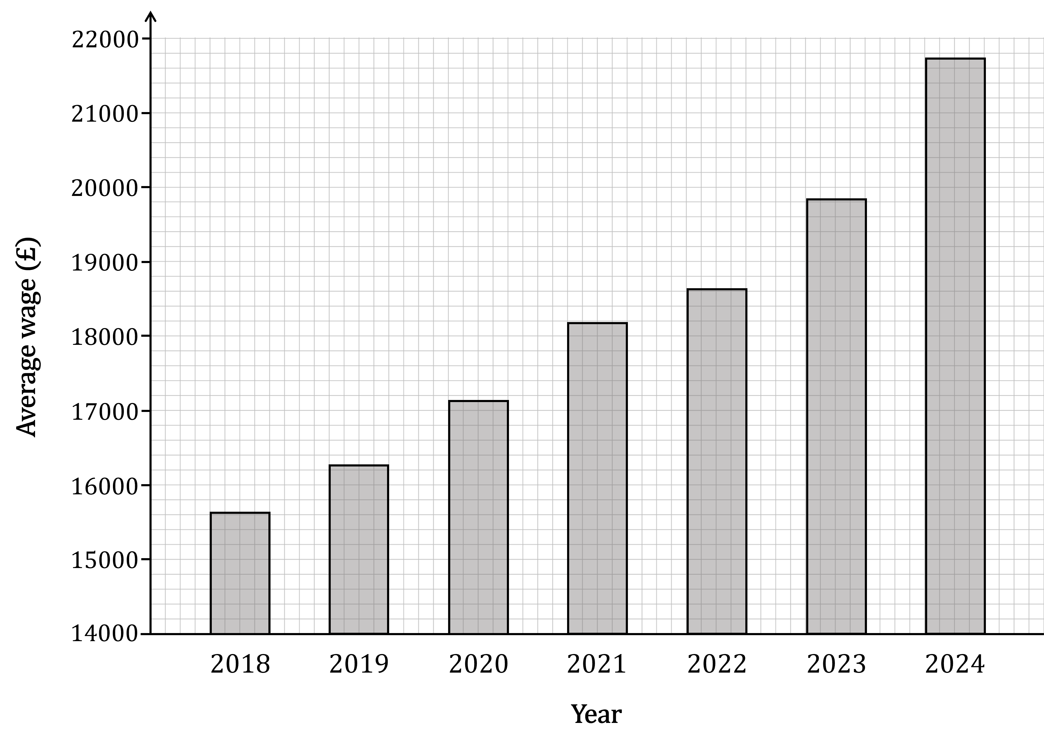
Identify a feature of this diagram that might cause it to be misleading, and suggest a reason why the CEO may have chosen to use a bar graph in this form.
The vertical scale of the bar graph does not start at zero
This does not make the bar chart 'wrong', but it could make it misleading
For example, the 2024 bar is almost 5 times as tall as the 2018 bar, but the 2024 average wage is not 5 times greater than the 2018 average wage
(The average wage did increase between those years, but only by about 40%)
The scale for the 'average wage' does not start at zero. This could be misleading because if you just look at the size of the bars, it can make the wage increases seem a lot bigger than they really were.
The CEO may have chosen this to make the pay rises seem more impressive to the union members. If the bars had started at zero, the changes from year to year wouldn't seem as great.

You've read 0 of your 0 free revision notes
Get unlimited access
to absolutely everything:
- Downloadable PDFs
- Unlimited Revision Notes
- Topic Questions
- Past Papers
- Model Answers
- Videos (Maths and Science)
Did this page help you?