Scatter Diagrams & Correlation (Edexcel GCSE Statistics)
Revision Note

Author
RogerExpertise
Maths
Scatter Diagrams & Correlation Basics
What is correlation?
Correlation describes how two quantities are related to each other
Positive correlation is when one quantity increases and the other quantity also increases
For example, as temperature increases, sales of cold drinks increase
Negative correlation is when one quantity decreases while the other quantity increases
For example, the value of a car decreases as its age increases
Zero (no) correlation is where there is no apparent relationship
For example, the masses of snails and students' scores in an exam
If there is a relationship between two quantities then we say that the quantities have an association (or that the quantities are associated)
Temperature and sales of cold drinks are associated
Masses of snails and scores in an exam are not associated
What does the phrase "correlation does not imply causation" mean?
If two quantities correlate, it does not mean that one causes the other one
For example, each day you record the height of a sunflower and the weight of a puppy
As the height of the sunflower increases, the weight of the puppy increases
This is a positive correlation
But you cannot claim that:
'If you want your puppy to weigh more, make your sunflower taller!'
or 'Sunflowers grow better when puppies are heavier!'
Both quantities may be increasing due to another reason
In this case, time
You should also be aware that multiple factors may interact and cause two quantities to change
For example a study may find correlation over time between rising carbon dioxide levels in the atmosphere and rising levels of obesity
But carbon dioxide in the atmosphere doesn't cause obesity
Instead populations have become richer over time
And richer populations tend to emit more carbon dioxide and have higher levels of obesity
What are scatter diagrams?
Scatter diagrams (or scatter graphs) are used to plot pairs of data
For example, students' Maths grades against their Physics grades
The vertical and horizontal axes represent the two quantities being measured
In an experiment where it is suspected that one variable is affecting the other variable
the explanatory (or independent) variable should be plotted on the x-axis (horizontal axis)
the response (or dependent) variable should be plotted on the y-axis (vertical axis)
Points are plotted as crosses, ×
They are not joined up
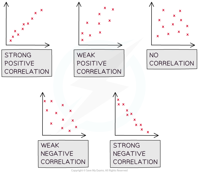
The general shape formed by the points shows the type of correlation
Positive correlation goes from bottom left to top right
A positive gradient
Negative correlation goes from top left to bottom right
A negative gradient
No (zero) correlation looks like a cloud of points
You should also be able to talk about the strength of a correlation
There is strong correlation if the points are close to lying along a straight line
There is weak correlation if the points are not close to lying along a straight line
Worked Example
A teacher is interested in the whether the amount of time her students spend on a computer per day is related to the amount of time they spend on a phone per day. She takes a sample of nine students and records the results in the table below.
Hours spent on a phone per day | Hours spent on a computer per day |
|---|---|
7.6 | 1.7 |
7.0 | 1.1 |
8.9 | 0.7 |
3.0 | 5.8 |
3.0 | 5.2 |
7.5 | 1.7 |
2.1 | 6.9 |
1.3 | 7.1 |
5.8 | 3.3 |
(a) Draw a scatter diagram for the data.
Plot these points on a scatter diagram, with phone time on the horizontal axis and computer time on the vertical axis
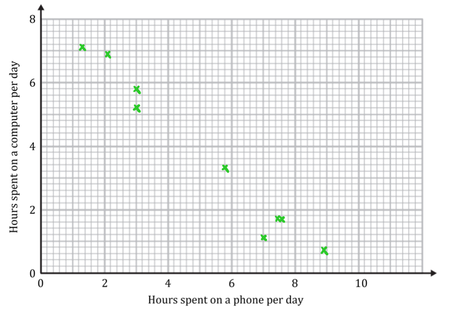
(b) Describe the correlation.
The points go from top left to bottom right (negative gradient) so there is negative correlation
The points are close to lying on a straight line so it is strong correlation
Strong negative correlation
(c) Interpret the correlation in the context of the teacher's data.
As phone time increases, computer time decreases
The more time a student spends on a phone, the less time the student spends on a computer

You've read 0 of your 0 free revision notes
Get unlimited access
to absolutely everything:
- Downloadable PDFs
- Unlimited Revision Notes
- Topic Questions
- Past Papers
- Model Answers
- Videos (Maths and Science)
Did this page help you?