Quantitative & Qualitative skills (AQA A Level Geography)

Topic Questions

1
Sme Calculator
6 marks

Figure 5 shows data relating to coastal flooding in Great Britain. The investigation is trying to determine whether any stretch of the coastline of Great Britain may be more or less susceptible to coastal flooding. The 96 most severe floods have been analysed.

The coastlines have been split into four broad categories: north west, north east, south west and south east.

This is the null hypothesis: there is no significant difference in the location of the worst floods to affect Great Britain.

Below is a partly completed Chi-squared test.

Figure 5

  North west North east South west South east Total
O 22 16 38 20 96
E 24 24 24 24 96
O −E −2 −8 14 −4 -
left parenthesis straight O space minus space straight E right parenthesis squared over blank 4 64   16 -
left parenthesis straight O space minus space straight E right parenthesis squared over straight E 0.17   8.17 0.67 x2 =

O – Observed frequencies
E – Expected frequencies

Figure 6

Critical values for Chi-squared with 3 degrees of freedom.

Degrees of freedom

Significance level

0.05                            0.01

3 7.82 11.34

Complete Figure 5 and interpret your Chi-square result using Figure 6.

[6]

Did this page help you?

2
Sme Calculator
6 marks

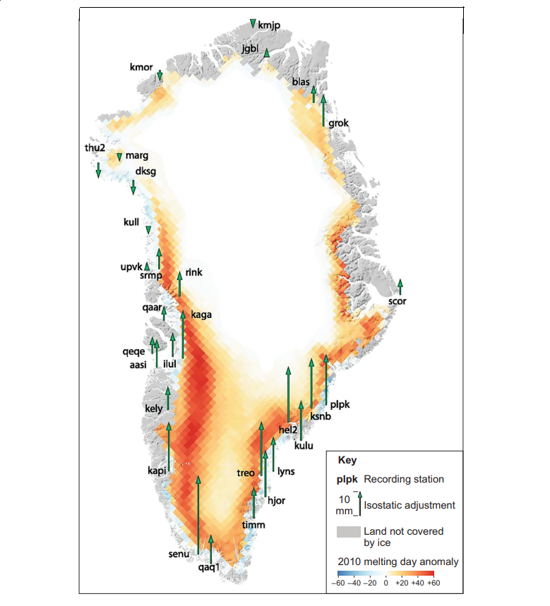
Figure 5 shows the isostatic adjustment in 2010 (green arrows) for selected recording stations in Greenland. Information on the 2010 melting day anomaly is also shown.

Figure 5 – the isostatic adjustment in 2010 (green arrows) for selected recording stations in Greenland. Information on the 2010 melting day anomaly is also shown.

fig-5-inserts-paper1-nov2020-aqa-alevel-geography

Note: 1 Melting day anomaly refers to the extra days of melting relative to the 1979–2009 average.

2 Isostatic adjustment refers to the change in the land level relative to sea level.

b)
Analyse the relationship between isostatic adjustment and the 2010 melting day anomaly in Greenland as shown in Figure 5.

[6]

Did this page help you?

3
Sme Calculator
6 marks

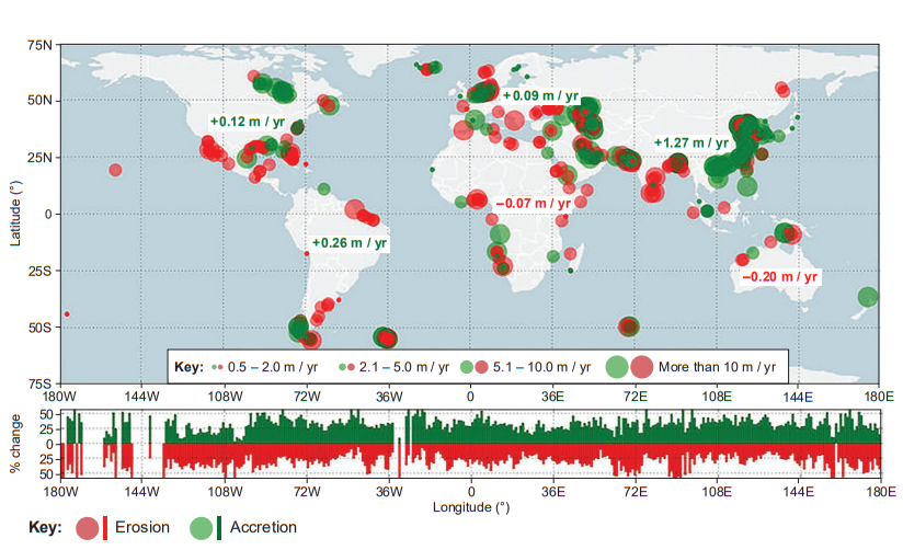
Figure 5 shows data related to the distribution of beach erosion and accretion measured from 1984 to 2016. Accretion occurs when more sand is accumulated on beaches than is lost to erosion.

Figure 5

Distribution of beach erosion and accretion from 1984 to 2016

fig-5-inserts-paper1-june2019-aqa-alevel-geography

The bar graph beneath the map presents the relative occurrence of eroding and accreting sandy shorelines per degree of longitude. The numbers presented on the map represent the average change rate for all sandy shorelines per continent.

Analyse the data shown in Figure 5.


[6]

Did this page help you?