Study Figure 9, a map showing world oil consumption in 2016.

Did this page help you?
Study Figure 9, a map showing world oil consumption in 2016.

Did this page help you?
Study Figure 11, a map of South and East Asia showing the percentage of people who were undernourished between 2014 and 2016.
6
7
8
9
Did this page help you?
Study Figure 12, a map of Africa showing percentage access to basic drinking water services in 2015.

8
9
10
11
Did this page help you?
Study Figure 13, a map of Europe showing the percentage energy consumption from renewable sources in Europe (excluding Russia) in 2014.

5
6
7
8
Did this page help you?
Study Figure 9, a table showing mango imports into the UK, 2012–2016.
Figure 9
| Year | Mango imports (1000 tonnes) |
| 2012 | 38 |
| 2013 | 47 |
| 2014 | 47 |
| 2015 | 56 |
| 2016 | 66 |
|
Show your working Nearest whole percentage = |
Did this page help you?
Food
Study Figure 11, a graph showing daily protein consumption for selected countries, 1960–2013.

| Country | Daily protein consumption 2013 |
| Nigeria | 64 grams |
| Mozambique | 46 grams |
Did this page help you?
Water
Study Figure 12, information about the water crisis in Cape Town, a city in South Africa, a LIC/NEE country.
Figure 12
Restrictions on the amount of water available per person per day:
|

Did this page help you?
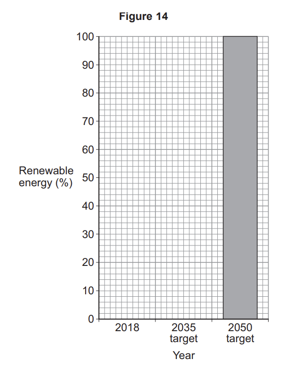
Study Figure 14, a graph showing the percentage of energy from renewable sources in the Balearic Islands, a region of Spain.

| Year | Renewable energy (%) |
| 2018 | 4 |
| 2035 target | 35 |
Study Figure 15, a newspaper article about energy in the Balearic Islands.

Did this page help you?
Did this page help you?
Study Figure 11, a map of Africa showing the percentage of population that was undernourished between 2016 and 2018.

| Country | % of population undernourished |
| Egypt | less than 5 |
| Central African Republic | 25 or more |
Did this page help you?
Study Figure 13, a map of Africa showing the water footprint per person per year.

| Country | Water footprint m3 per person per year |
| Niger | more than 2000 |
| Central African Republic | 1001–1384 |
Did this page help you?
Study Figure15, a map of Africa showing the percentage of population with access to electricity in 2017.

| Country | % of population with access to electricity |
| Libya | 50–74.99 |
| Central African Republic | 25– 49.99 |
Did this page help you?
Study Figure 9, a map showing the levels of well-being for young people in selected countries.

Did this page help you?
Study Figure 11, a divided bar chart showing the typical daily diet in the UK and Somalia.

| Food | % calories |
| Dairy and eggs | 24 |
| Meat | 7 |
Did this page help you?
Study Figure 13, a divided bar chart showing water use by different sectors of the economy in Europe, Africa and Asia.

| Sector | % water used |
| Industry | 10 |
| Household | 9 |
Did this page help you?
Study Figure 15, a divided bar chart showing the energy mix in the European Union (EU) and China.

| Energy source | % energy generated |
| Coal | 59 |
| Gas | 6 |
Did this page help you?
Suggest how poor water supply may affect social well-being
Did this page help you?
Food
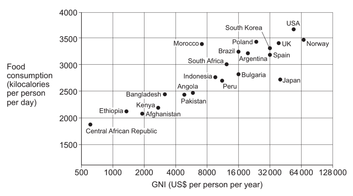
Study Figure 12, a graph showing GNI per person and food consumption per person for selected countries.
Figure 12

Plot the following data on to Figure 12.
| Country | GNI (US$ per person per year) |
Food consumption (kilocalories per person per day) |
| Botswana | 16 000 | 2300 |
Which country is identified by the following data?
| GNI (US$ per person per year) |
Food consumption (kilocalories per person per day) |
| 32 000 | 3200 |
Draw a best fit line on Figure 12.
Describe the relationship between GNI and food consumption shown in Figure 12
Outline one or more reasons for the link between GNI and food consumption
Give two impacts of food insecurity.
Did this page help you?
Water
Study Figure 13, a graph showing GNI per person and the percentage of rural areas with a basic water supply for selected countries.
Figure 13

Plot the following data on to Figure 13.
| Country | GNI (US$ per person per year) |
Basic water supply in rural areas (%) |
| Botswana | 16 000 | 58 |
Which country is identified by the following data?
| GNI (US$ per person per year) | Basic water supply in rural areas (%) |
| 4000 | 52 |
Describe the relationship between GNI and access to a basic water supply shown in Figure 13.
Outline one or more reasons for the link between GNI and water supply
Give two impacts of water insecurity
Did this page help you?
Energy
Study Figure 14, a graph showing GNI per person and energy consumption for selected countries
Figure 14

Plot the following data on to Figure 14.
| Country | GNI (US$ per person per year) |
Energy consumption (kg oil equivalent per person per year) |
| Botswana | 16 000 | 1200 |
Which country is identified by the following data?
| GNI (US$ per person per year) | Energy consumption (kg oil equivalent per person per year) |
| 8000 | 450 |
Draw a best fit line on Figure 14
Describe the relationship between GNI and energy consumption shown in Figure 14
Outline one or more reasons for the link between GNI and energy consumption
Give two impacts of energy insecurity.
Did this page help you?
Study Figure 10, a graph showing the UK's changing energy mix from 2006 to 2016.

Using Figure 10 and your own understanding, discuss the issues arising from the UK’s changing energy mix.
Did this page help you?
Explain how different strategies can be used to make food supplies more sustainable.
Did this page help you?
Explain how different strategies can be used to make water supplies more sustainable.
Did this page help you?
Explain how different strategies can be used to make energy supplies more sustainable.
Did this page help you?
Study Figure 10, comments from a government report into water quality and pollution in the UK.
Figure 10
| The Environment Agency has asked water companies and farmers to reduce the number of pollution incidents harming England’s waters. They have also said penalties for pollution should be made tougher. The number of serious pollution incidents has reduced since 2001, but there were still 317 in 2016. The most common reasons for rivers having poor water quality were pollutants from farmland and sewage. These produce algae and reduce oxygen levels in the water. The Environment Agency says population growth, climate change and plastic pollution are some of the main threats to water quality in the future. |
Discuss the challenges of managing water quality and pollution in the UK.
Use Figure 10 and your own understanding.
Did this page help you?
‘A large scale agricultural development can bring both advantages and disadvantages.’
Explain this statement using an example you have studied.
Name of development ______________
Did this page help you?
‘A large scale water transfer scheme can bring both advantages and disadvantages.’
Explain this statement using an example you have studied.
Name of scheme _____________
Did this page help you?
‘Extraction of fossil fuels can bring both advantages and disadvantages.’
Explain this statement using an example you have studied.
Name of fossil fuel ___________
Did this page help you?
Study Figures 14a and 14b.
Figure 14a is a typical greywater system.
Figure 14b is a photograph of a garden water butt.
Figure 14a


Suggest how water supplies can be made more sustainable.
Use Figures 14a and 14b and your own understanding.
Did this page help you?
Study Figures 16a and 16b.
Figure 16a is a diagram showing energy conservation in the home.
Figure 16b is a photograph of an electric vehicle charging point.


Suggest how energy use can be made more sustainable.
Use Figures 16a and 16b and your own understanding.
Did this page help you?
Study Figure 10a and Figure 10b.
Figure 10a shows the amount of carbon dioxide (CO2) emitted to produce 1 kg of food.
Figure 10b is a screenshot of a local food organisation’s website.


‘Growing concern in the UK about the carbon footprint of food creates both opportunities and challenges.’
Use evidence from Figure 10a and Figure 10b to explain this statement.
Did this page help you?
Study Figure 12a and Figure 12b.

Suggest how food insecurity can have both economic and social impacts.
Use Figure 12a and Figure 12b and your own understanding.
Did this page help you?
Study Figure 14a and Figure 14b.

Suggest how water insecurity can have both economic and social impacts.
Use Figure 14a and Figure 14b and your own understanding.
Did this page help you?
Study Figure 16a and Figure 16b.

Suggest how energy insecurity can have both economic and environmental impacts.
Use Figure 16a and Figure 16b and your own understanding.
Did this page help you?
Study Figures 10a and 10b.
Figure 10a shows the cost of producing electricity in the UK by source.
Figure 10b is a photograph showing some issues regarding wind farms.


‘There are economic and environmental issues associated with the exploitation of energy sources.’
Use evidence from Figure 10a and Figure 10b to explain this statement.
Did this page help you?
Study Figures 12a and 12b.
Figure 12a is a photograph showing The Eagle Street Rooftop Farm in New York, a city in the USA.
Figure 12b is a food label.


Suggest how food supplies can be made more sustainable.
Use Figures 12a and 12b and your own understanding.
Did this page help you?
Suggest how food supplies have been made more sustainable.
Use an example of a local scheme in an LIC/NEE.
Name of local scheme
Did this page help you?
Suggest how water supplies have been made more sustainable.
Use an example of a local scheme in an LIC/NEE.
Name of local scheme
Did this page help you?
Suggest how energy supplies have been made more sustainable.
Use an example of a local renewable energy scheme in an LIC/NEE.
Name of local scheme
Did this page help you?