Presenting Observations & Data
- Data can be presented in a variety of ways, such as on graphs, charts, or tables
- Tables are applicable to any experiment yielding data
- Graphs, on the other hand, are a little trickier depending on the type of data collected e.g. quantitative or qualitative
- Quantitative data uses numerical values
- Qualitative data is observed but not measured with a numerical value e.g. colour
Presenting Data in a Table
- When taking readings, a sensible range should be taken, and the values should all be stated to an appropriate number of significant figures or decimal places
- This is usually the same number as the resolution of the measuring instrument
- The columns in any table should have both a quantity and a unit in their heading
- When labelling columns, the names of the quantities should be separated from their unit by a forward slash ( / )
- For data displayed in a table:
- The first column should contain the independent variable
- The second column should contain the dependent variable
- If repeat readings of the dependent variable are required, these should be included with a column for the mean value at the end
- Any columns required for processing data e.g. calculations should come after this
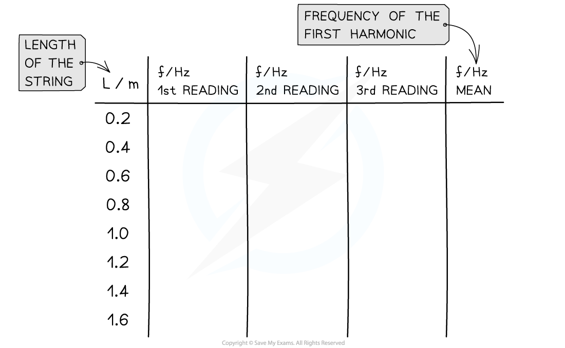
Conventions for presenting data in a table. The length is the independent variable and the frequency is the dependent variable
Presenting Data on a Graph
- All readings, including suspected anomalous results, should be plotted on a graph so that they can be easily identified
- When taking repeat readings, it is the mean value that is plotted
- The way data is presented on a graph depends on what type of data it is
- Only certain values can be taken, normally a whole number e.g. number of students
- This should be displayed on a scatter graph or bar chart
- Can take any value on a scale e.g. voltage in a circuit
- This should be displayed on a line or scatter graph
- Values that can be sorted into categories e.g. types of material
- This should be displayed on a pie or bar chart
- Data that can be put in ordered categories e.g. low, medium, high
- This should be displayed on a bar chart
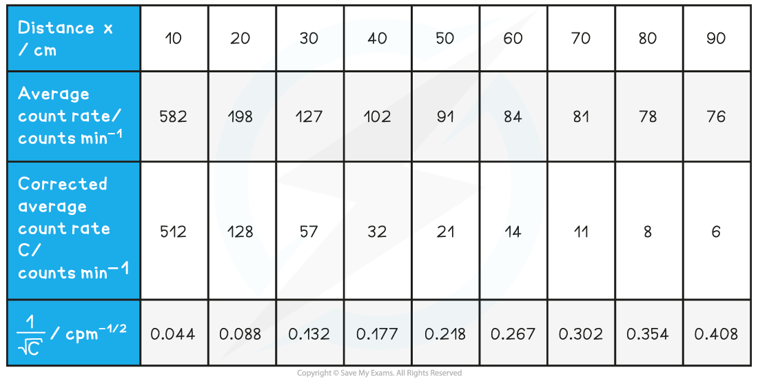
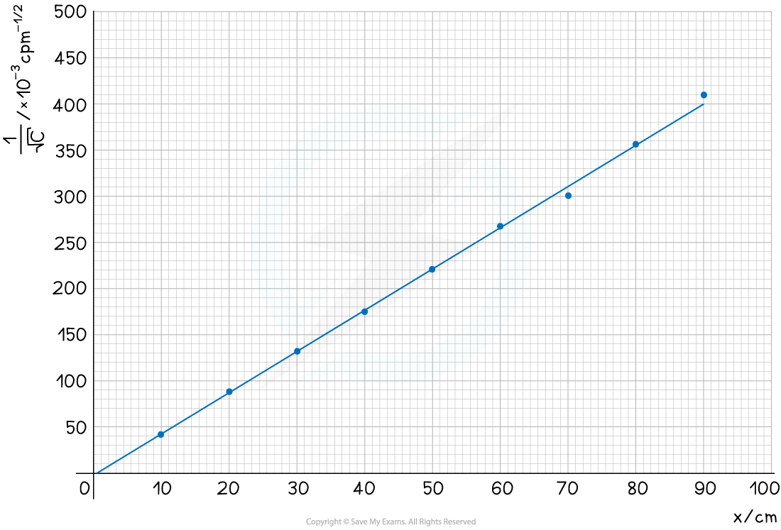
 The student is trying to verify the inverse square law of gamma radiation on a sample of Radium-226. He collects the following data:
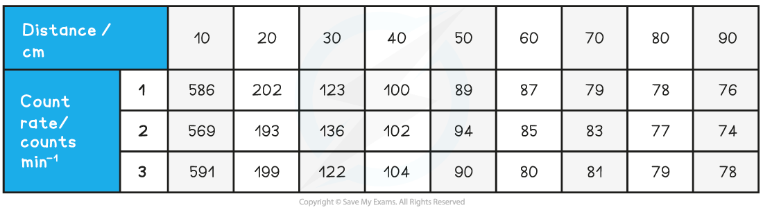 Use this data to determine if the student’s data follows an inverse square law.